Friday, April 6, 2007
sleepy hollow
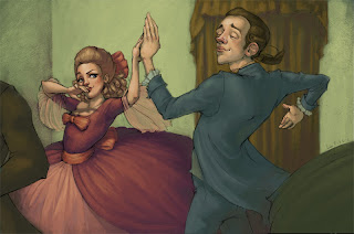
so here is my digital illustration final! i just finished it and printed it out! ...i kind of messed that up and her dress is neon pink with neon purple shadows.. ahaha
so there are some composition problems i need to fix and im going to add wallpaper and fix a value problem on ichabod's face... but its as done as its going to be at this moment!
man I really am starting to love photoshop! its soo fun and Ive finaly learned to blend! yaya!!!
ohh by the way its a 2 page spread from sleepy hollow ... ichabod and katrina dancing
Monday, March 26, 2007
photoshop lifedrawing
Art Dump!
Now that I dont have to do Illustration Friday I decided to post some random art I did this school year that i have scanned... yeah!
This one is pretty cool because It was chosen to be in the Society of Illustrator's student show!holy cow im so excited!
Guache
A guache painting! (pronounced goo-atch-ay)
An acrylic study... actually i really like this one now that Ive had some time away from it... i really want to do more acrylic on wood
I spy
Wednesday, March 7, 2007
hide
here is my hide painting... its really more about the painting and trying to learn to paint on the computer than the concept however the idea behind it is that she is hiding her eyes behind her glasses...
you wouldnt believe how people think you cant see them just because they are wearing sunglasses(I had many strange moments when i worked at hershey park because of this.. lol)
the technique was using a warm under painting and a cool over painting and then using layer masks to "scratch" it off... its similar to a packaging tape technique that I learned in Media Experimentation...I had fun i think
I used an adorable photo from blackpillow.deviantart.com for refference...
enjoy~
Wednesday, February 28, 2007
Communication...
Friday, February 23, 2007
I heart Voldie!!!
This is a Drawing I did for my amazing Creative Perspective class.
The assignment was to create a villan's "lair" And I decided to design Bellatrix Lestrange's stuy/living room. If you dont know who she is, she is a character from Harry Potter and you can learn almost everything about her here:
http://en.wikipedia.org/wiki/Bellatrix_Lestrange
I decided I wanted her house to be a victorian themed twisted place where all the details were creepy or evil. She is also Voldermort's #1 biggest fan, thus the title "I heart voldie" and the ginormous like 6 foot tall portrait of him over the mantel.
Unfortunaly The printer i needed to use to print it off for my class was out of YELLOW ink so i couldt print my BLACK AND WHITE picture off and I had to tape my tracing paper to a piece of paper.. Needless to say, I dont think My teacher, Wade Huntsman, could even see past the horrible presentation to see my drawing though! hehe! There is ink now so It's all good!
Enjoy!
Wednesday, February 21, 2007
Yay!
here is a little study i did in my digital illustration class today. I was suposed to be doing something with cmyk channels but i just started drawing in black and white to try to start to get a feel for the digital medium. I am excited about the result i got... its not anything amazing but im starting to understand how to paint with the computer i think. Hopefully i will be able to get this kind of result in color!
I feel like its taking forever for me to begin to grasp this but how many pencil drawings did i have to do before they started to turn out like this... maybe a million... its all about mileage i supose...
Friday, February 16, 2007
Gravity
Here is my IF post for Gravity! It was done in a "woodcut" technique that i learned in Digital illustration.
So i went for the "grave" part of gravity and made a very forlorn floating flying head. He is also flying which is going against gravity
there is some historical context to this though. The floating wing head with a wig was on some gravestones in the old first church cemetery in bennington vermont that i saw this summer. It took me forever to find a picture of one of the said gravestones to use for refference. I would think the freaky wig guy would be more popular amoung photographers but oh well!
I had fun with this technique and did a fairly simple image because of a lack of time. 'twas fun!
Wednesday, February 14, 2007
scratchboard
Tuesday, February 13, 2007
crash
so here is crash. the assignment was to use texture... i did that on my last one so i tried to switch it up a little and just multiply it instead of painting with it. it was pretty fun... im really tired right now though so i dont feel like writing any more... enjoy!
the subject matter is dedicated to Wade Huntsman...
Wednesday, February 7, 2007
photoshop is weird
Sprout!
Friday, February 2, 2007
Murray Kimber
This is a study for my digital illustration class. The assignment involves using linework that is scanned in in photoshop. The drawing is a little doodle i did this morning durring a demo/critique thing that Murray Kimber did for the Illustration majors at my school. He is awesome.
As far as the technique Im pretty excited. Im not great at it but I feel like I can learn it! This morning i was saying to myself that I didnt think That I would never choose to do an image in photoshop rather than traditionaly but after trying painting in photoshop i think that my mind is changing.
I really need to learn how to do some better blends though... i would like to have a mixture of nice transparent washes that blend perfectly and more painterly strokes. Hopefully that control will come over time as I learn how to use this!
Wednesday, January 31, 2007
Red
So here is my "cut paper" Illustration for my Digital class and IF. I am cutting it so close(class is in less than an hour) that I havent gotten to sign it... Also when i rastersomethinged it there were a couple of glitches. My file got so huge! i think it might be because my textures were way too big... but whatever. I learned alot. The most frusterating thing for me was my file size (i couldnt change computers! i finaly figured it out though) It was very time consuming... but I learned a whole lot!
As far as my subjectmatter goes... the prompt was "red" .. I guess it was inspired by the non-pc slur for Native Americans, "redskin" but I loved drawing it and doing my research. aslo the Souix women would paint red circles on their cheeks so thats my red in the picture
Monday, January 22, 2007
penguin practice
Here is my study for the "cut paper" tequnique that I just learned from Scott Franson, my digital illustration prof. The proccess involves using illustrator to get the basic shapes and then moving it all into photoshop to color. I had alot of fun and I think that this whole "digital art" thing is starting to be a little more intuitive for me.... a little!
Saturday, January 20, 2007
Super Hero!
Now this is what I call a super hero (aka the man of my dreams)! I originaly was going to draw a little boy (aka tyler barnum) flexing in front of a mirror... but yeah thats not what endend up happening. This was for my digital illustration class. The assignment was use illustrator to make a picture for IF so here you go.
Wednesday, January 17, 2007
Birdie!
This is my little expariment with vector art! how exciting. There are a few problems with tangents but at an hour after class i got fatiuged and had to stop. Vector art is fun and im starting to get a hang of the pen tool. I think from now on i will draw out my composition ahead of time just to get an idea of exactly what im going to do. it was a little confusing to try to figure out my colors, composition and how to used illustrator all at the same time. be on the lookout for a sweet illustration friday post next week with this technique!!!
Tuesday, January 16, 2007
80's
So here is my first ... I mean second (if you count my cube)... assignment for my Digital Illustration class. The assignment was to do an illustration in whatever digital media i felt most comfortable with. I'm not comfortale with any digital media so the "digital" part of this image was scanning it.
As far as the concept goes, it's my solution to the rubik cube (or is it rubix?)! I also used a typical 80's color scheme with almost neon renditions of the primary colors.
Medium: Guache (goo-atch-e)
Subscribe to:
Posts (Atom)